Corporate Digital Banking
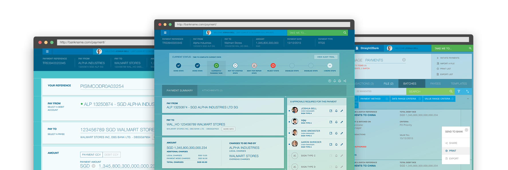
I focused on helping the bank create more engaging and intuitive online interactions to improve their partner, and employee digital banking experiences. We also helped establish a long-term, collaborative approach to the bank's web and mobile initiatives.
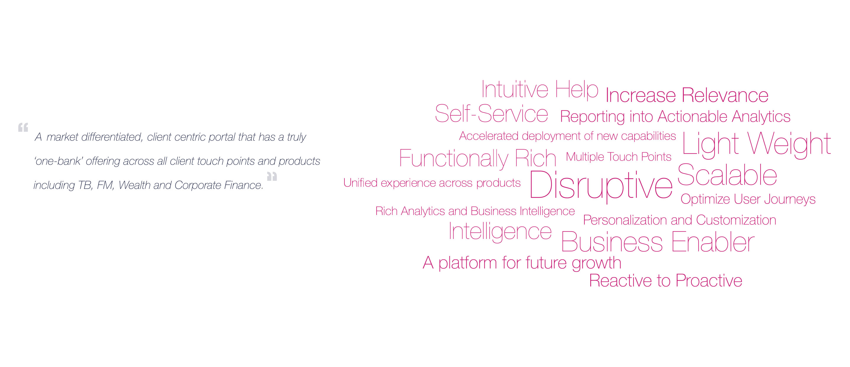
My work with the client started with reimagining the content and extending the existing Bank's global style guide. The aesthetic approach with the application was designed to break away from the stereotype of the conventional corporate banking website – crammed, verbose and confusing. Whitespace and bold, large typography were prioritized to make the pages friendly, focussed and easily readable.
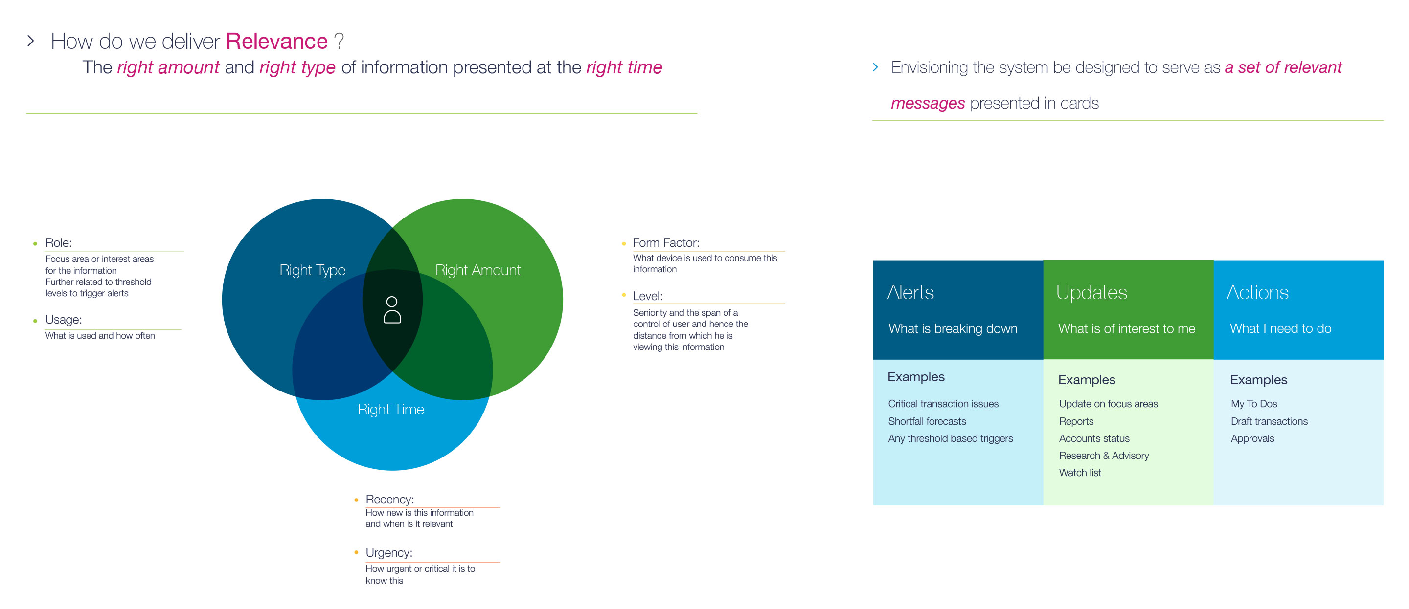
• Content consumption was another key issue to address as corporate banking data is complicated and large hence content was broken into crisp, scan-able units and relevant information were provided on each page to help the user.
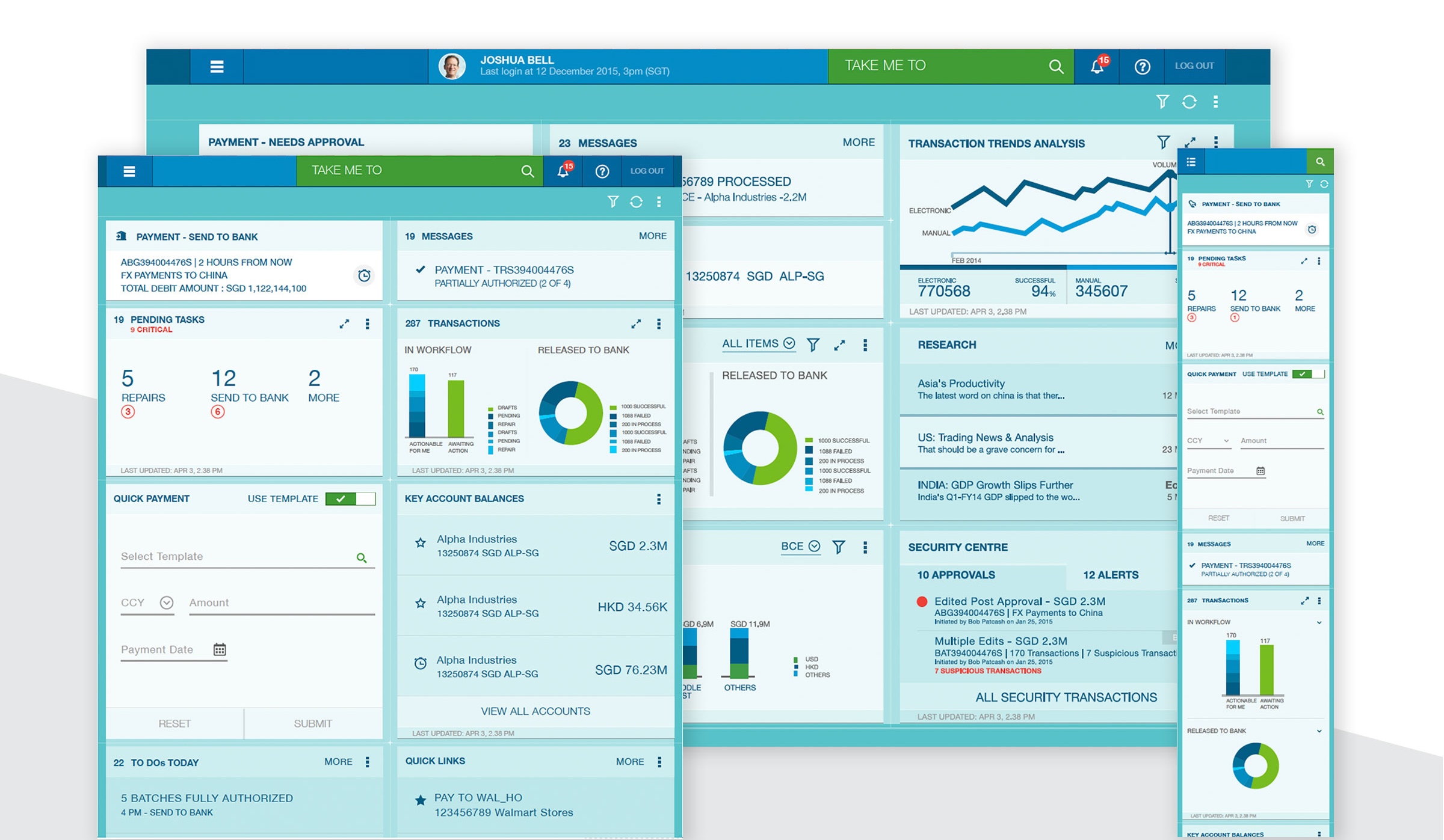
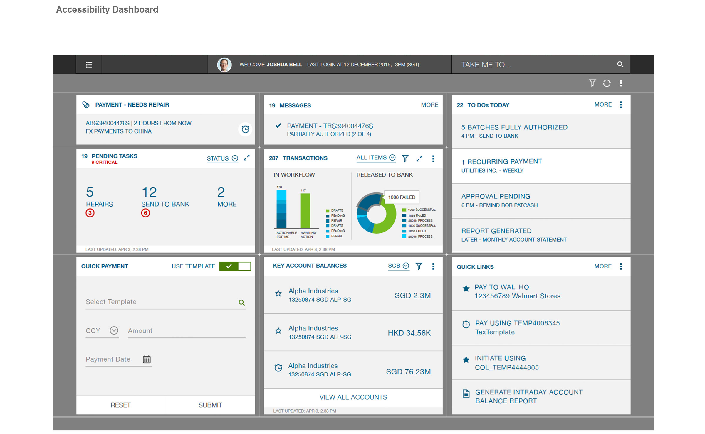
• A card-based UX system was chosen– it is fresh and flexible and organise information into chunks of content and aid for scannability. The dashboard which is "an easy to read, often single page, real-time user interface, showing a graphical presentation of the current status (snapshot) and historical trends of an organization’s or computer appliances key performance indicators to enable instantaneous and informed decisions to be made at a glance; was the initial design.
My role also involved Testing of the UX & Visual Interface Design & UI Sanity Testing
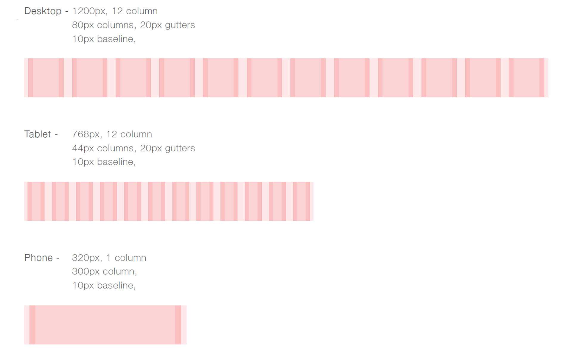
Grid Specification
Iconography & Font
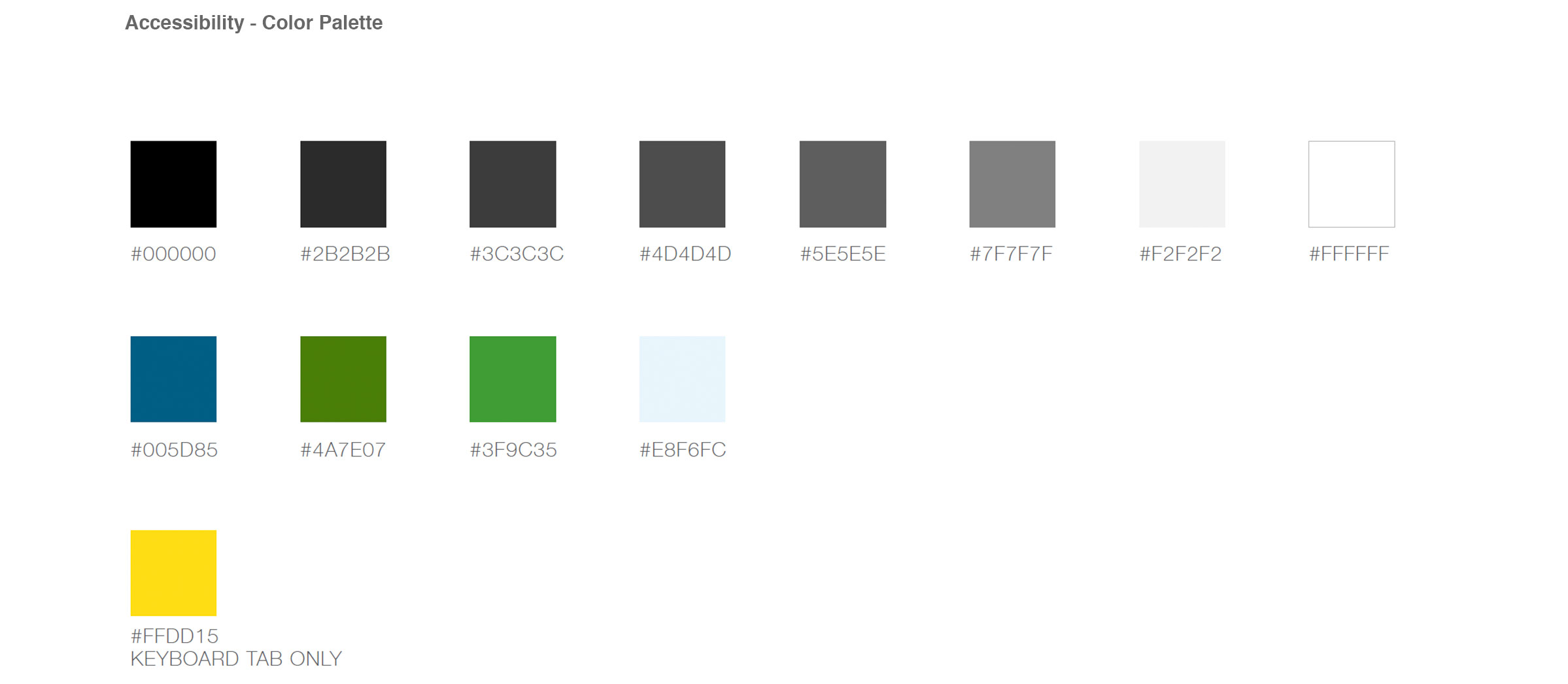
Color & Initial Idea
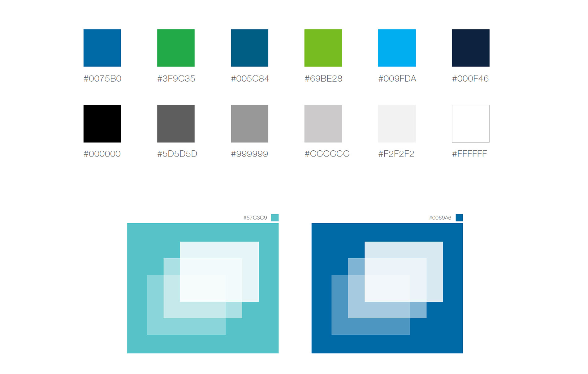
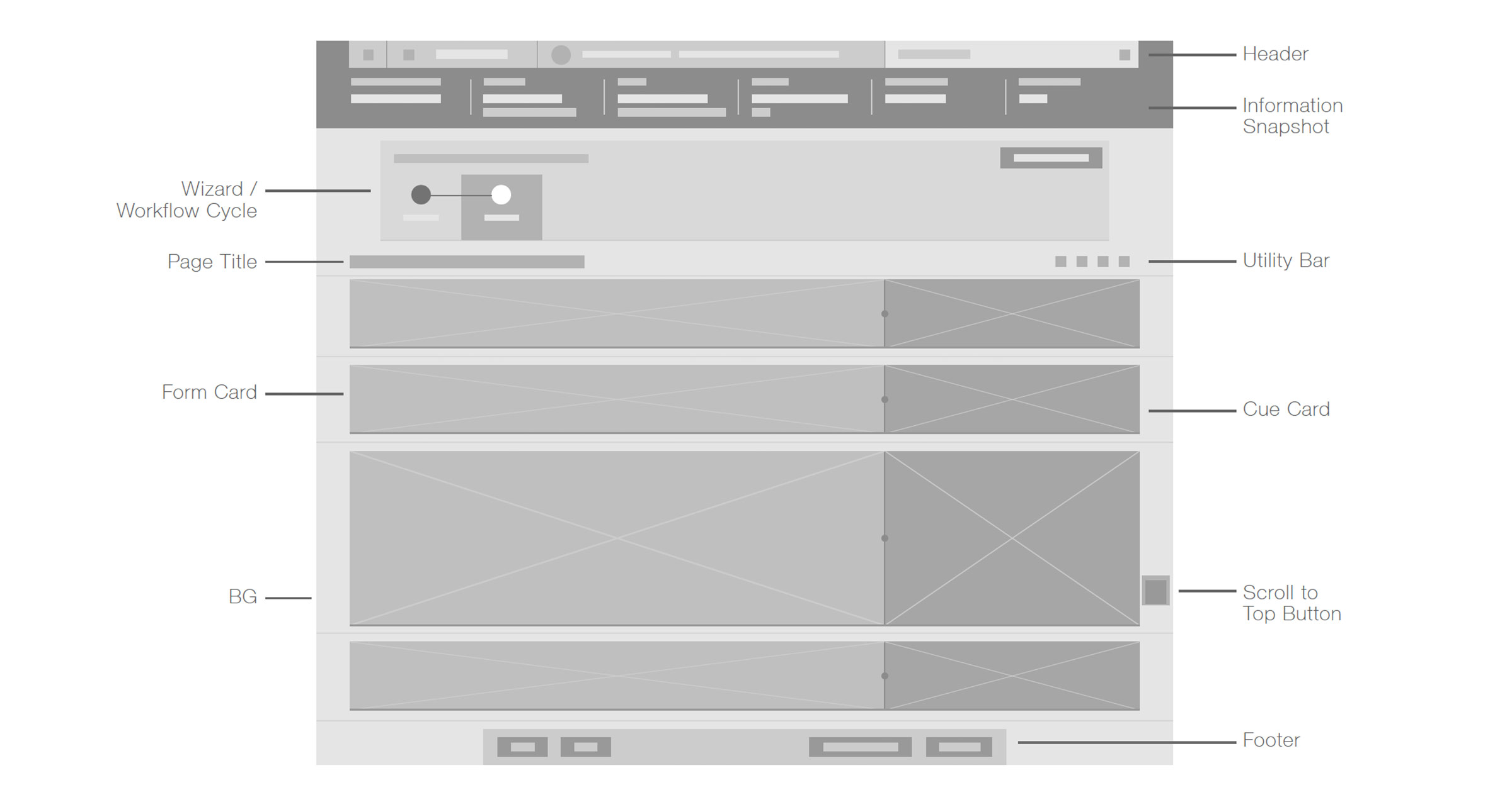
Page Overview
Custom Font Icons
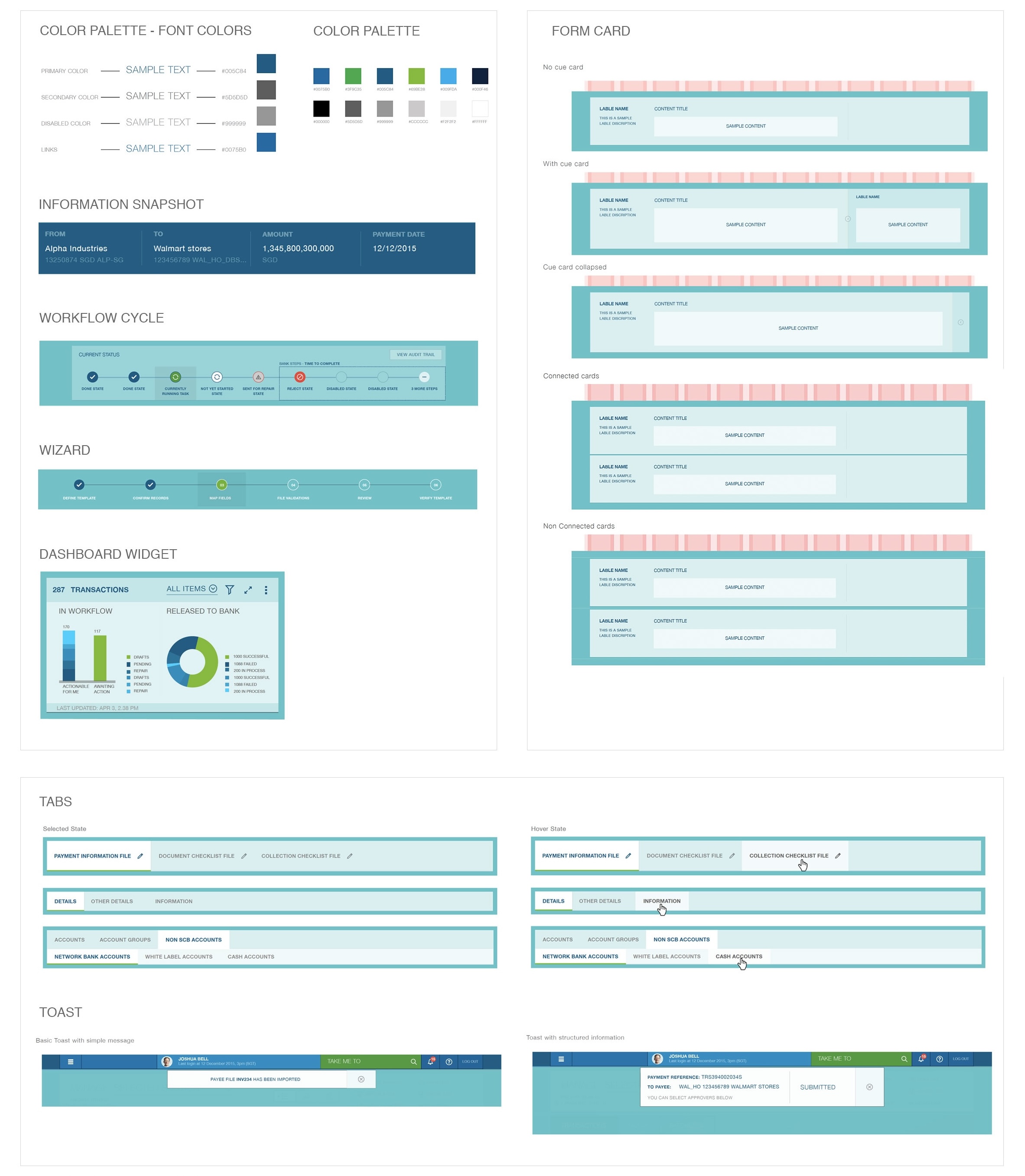
Style Guide
Grids
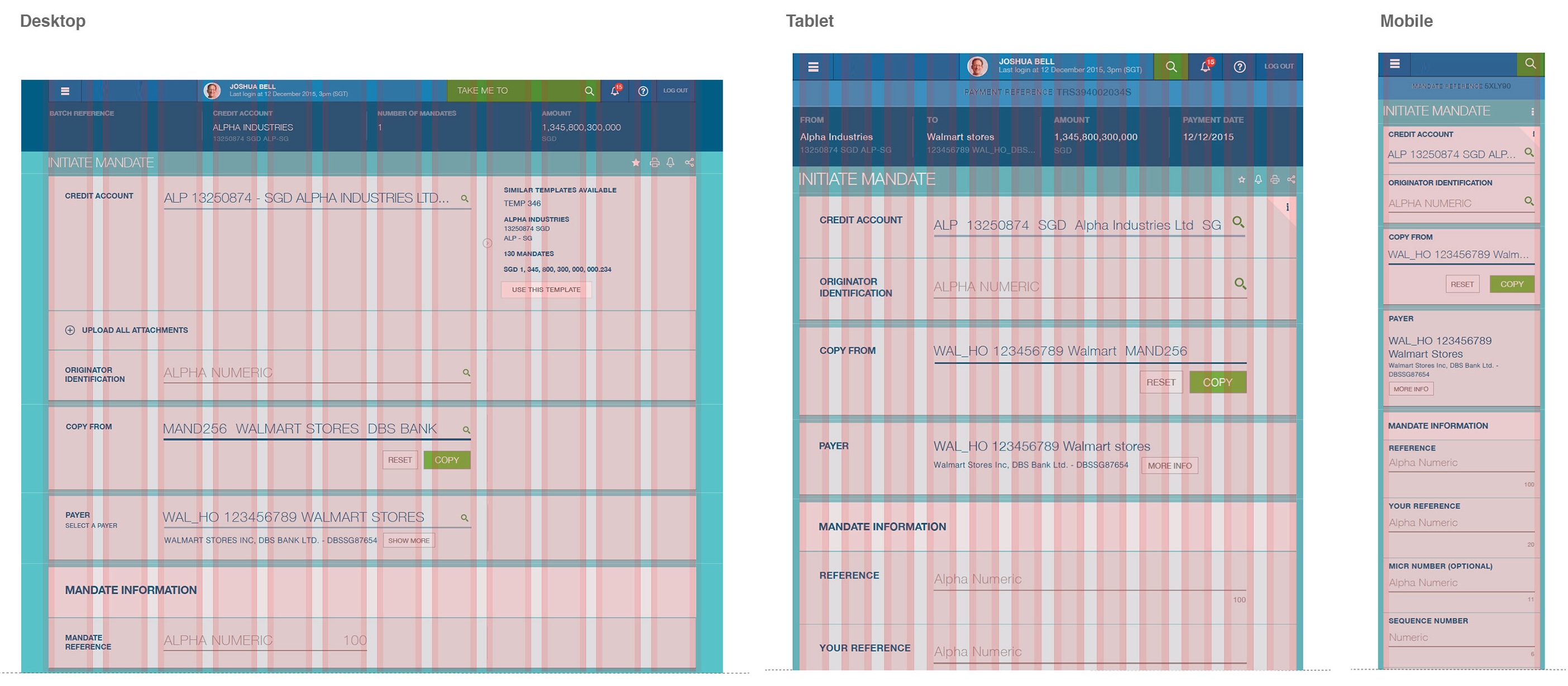
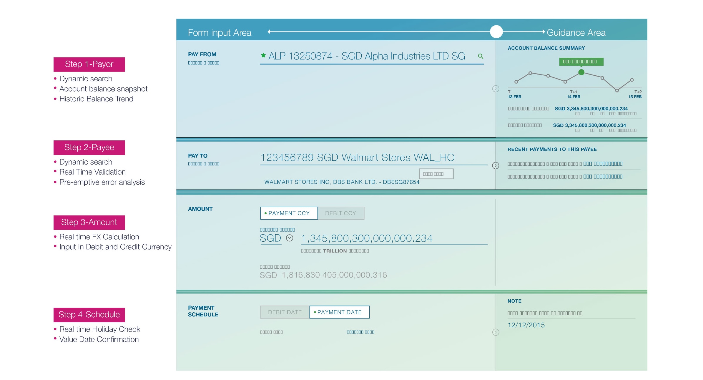
Payment Initiation - Progressive, Intutive & Consistent
Dashboard
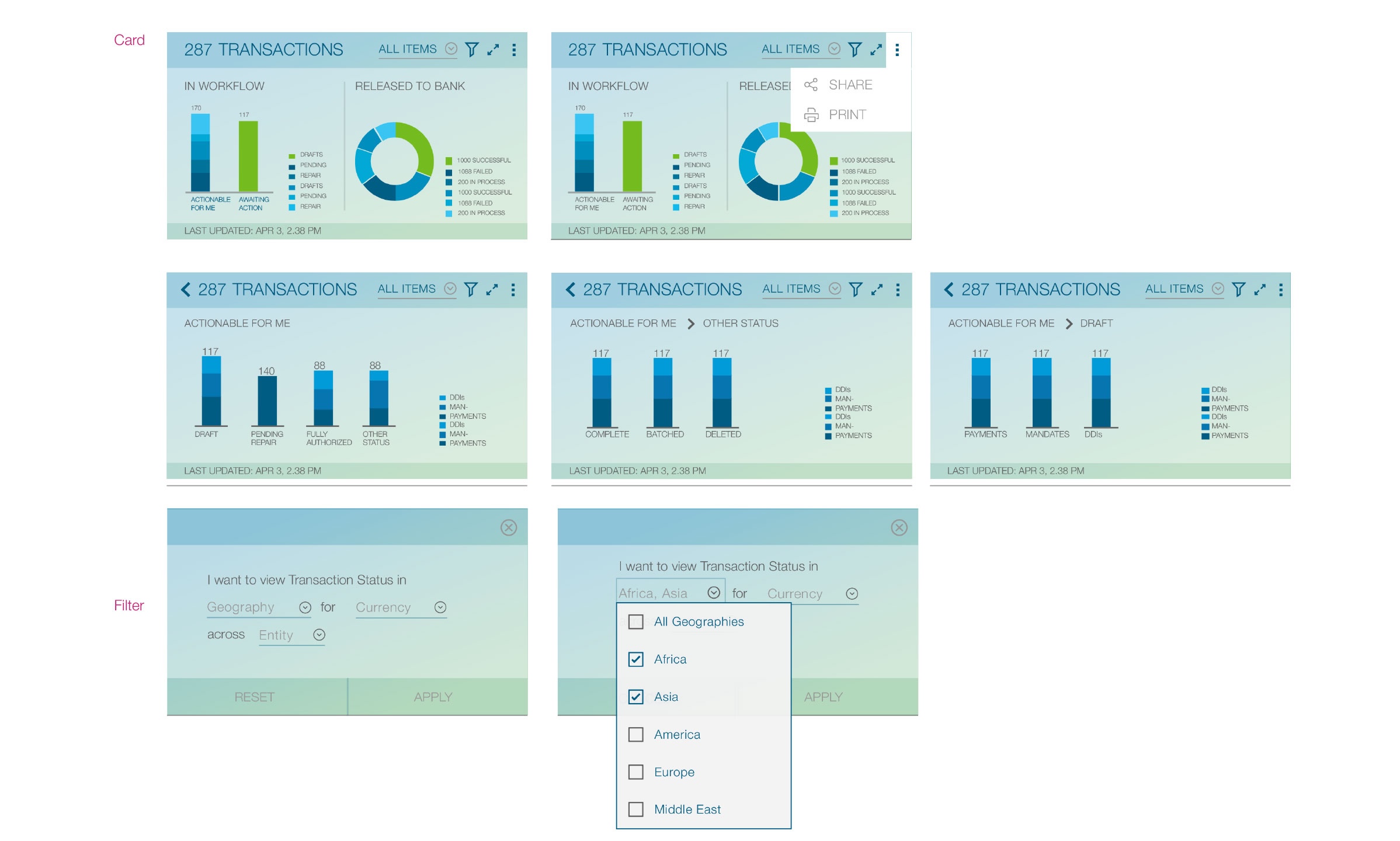
Transaction Statust
Account Balance

Stakeholder Analysis
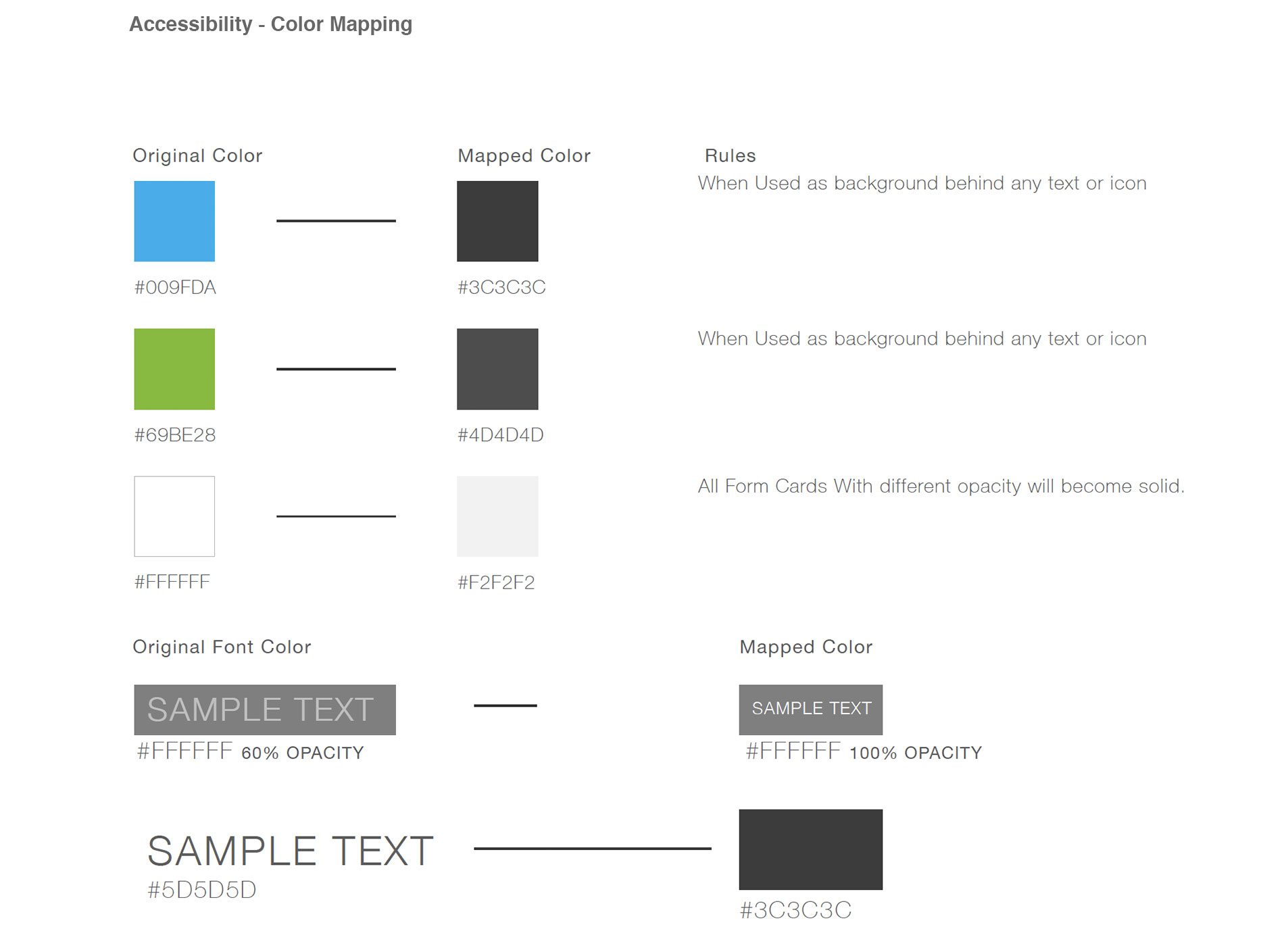
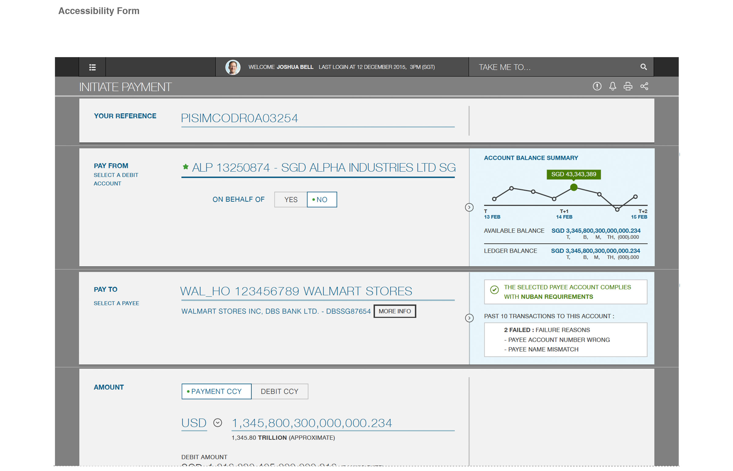
Web accessibility refers to the inclusive practice of removing barriers that prevent interaction with, or access to websites, by people with disabilities.
When sites are correctly designed, developed and edited, all users have equal access to information and functionality.
SCB making from RBiswas5888 on Vimeo.
Copyright ©. All Rights Reserved. — Designed with love by Rbiswas